Why I (heart) Frank
I'm due for a return visit to the library tomorrow for some more Godwin scans. In the meantime I offer a couple of fine samples I found on the Internet. I want to share them both because they're great reproductions and because they show off the many sides of this versatile illustrator. First up is an original Godwin painting from Illustration House. It came without source information.
While a little slicker in finish than many of Godwin's paintings, this presentation of an immigrant family demonstrates that Frank painted as well as he penned. I get a late 1920s vibe from the costuming, though the smooth painting style foreshadows late-1930s and early-1940s illustrations. The husband's face captivates me. His expression tells volumes about his thoughts, his experiences, his personality. A beautiful piece!
Also from Illustration House came this penanink rendition of Christ giving the money-changers what for:I believe this is part of a series Godwin illustrated for Collier's in the late 20s. This is Frank at his black-and-white best. Though Jesus' pose is a bit stiff, it's offset by everything else in the picture. The play of light against dark, the posing of the money-changers, the swirling drapery sculpted by seemingly hasty but actually carefully-drawn pen strokes, the handling of the high- contrast lighting on the men's faces...who could ask for more? This man was born to draw!
There's a lot of Rusty Riley to be found online, of which this is just one.It's a shame the scripts on Rusty Riley were so mundane...Godwin poured all of his skill and experience into the strip . Some of his Rusty drawings are as good as anything he ever did. This particular daily doesn't fall into that category. Technique-wise it's more of a "B/B plus" sort of original. I chose it because of the way it hearkens back to Godwin's Judge days, with the flamboyant caricatures of the painter and the mustachioed art buyer, and their exaggerated poses. I also like the "time lapse" effect of the last two panels. It's a rarity for Godwin. Like most cartoonists of his day he treated panels as a series of tableaux. The trick is really effective here. It's almost like looking at a flip book. Speaking of posing, the two crooks by the window are as lively as the foreground figures.
I saved this one for last...a real find. And a frustrating one! The site I took this from offered scans of a number of obscure early comic strips, mostly Sundays. Many seem to have come from Canadian papers. But there was no info on the pieces and no way to contact the owner. Here is the link to the main page. I recommend following all the sub-links. This magnificent page is surely one of Godwin's early syndicate jobs. In old newspapers there were countless examples of these "montage" pages in which the cartoonist suggested variations on a theme with a series of vignettes. Often these pages seemed like an excuse for the artist to draw his favorite stuff! They certainly brought out the best in many cartoonists--like this one did in Godwin. I'm guessing this was from the late teens or early twenties, as William
S. Hart's star had faded by the mid-1920s.
From the scribbled background lines and the sketchy treatment of the lion it's clear Frank knocked this out in a hurry. The fact that this knocked-out montage is still a knock-out technically demonstrates how great a command Godwin had of his medium and his drawing skills. Little marvels appear everywhere you look. The turbulent drapery on the "nice little spinster" (some spinster!) and her royal suitor...the Kley-like vigor of the thunderstruck Monte Carlo gamblers...everything about that lion!! And check out the hands. As one who's had trouble all his life drawing hands, I'm mesmerized by the way Godwin indicates them with the merest of gestures, yet they burst with convincing life.
Oh, geeze...I'm gushing again. Forgive me my purple prose, I just cain't get enough o' Frank!
Monday, May 18, 2009
Monday, May 11, 2009
Walter Jardine, Illustrator
From Alfredo to the Indies in Your Undies
The late, great Alfredo Alcala often cited J. C. Leyendecker as a major influence on his work. When we asked him about Walter Jardine, he always hemmed and hawed. Maybe he was hoping to keep Jardine to himself. Until recently about the only place one could find Walter Jardine's work was in Arthur Guptill's Drawing in Pen and Ink.
During a recent expedition through 1926 Collier's magazines I discovered this beautifully-rendered (and rather oddly-conceived) Jardine drawing in an ad for B.V.D. undergarments.
The cultural subtext of this illustration simply begs for deconstruction. Here are three strapping gents (Englishmen, probably) lolling about in their undies while an obsequious, turbaned native serves them tea. It's okay for him to see the sahibs in their skivvies because he's after all just a servant. The "white" gentlemen don't even notice him. What are they discussing? Cricket? Tiger hunting out in Indi-yah? And just how are we supposed to answer that saucy question, "What's back of that B.V.D. label"?
I feel these questions bear asking because of a smaller Jardine B.V.D. ad in a later issue. Unfortunately my scan screwed up. I'll have to go back to the library to get a post-able image. This ad shows two manly Americans in a forest. They stand by their tent, wearing only their undies, listening to records on a wind-up phonograph. "Next to myself," the headline reads, "I like B.V.D.'s best." Shades of Brooke Shields and her Calvins! The copy on this ad informs us, "The test of underwear comfort is to be able to forget you have underwear on!" Hmm. Are these guys forgetting?
Speaking of Alcala, the middle Englishman's face is about as Alfredo as an Englishman can get without turning Filipino.
Frank Godwin, Illustrator--1926
Frankly Godwin...Frankly Great
(At right, Frank Godwin's cover for Collier's, 18 September 1926)
I missed two days due to, of all things, writing a movie treatment (a long story). This post begins something I've wanted to do for twenty years: to take advantage of the Pasadena Public Library's magazine collection and scan work by the great illustrators and cartoonists hidden therein. It's about time I did. A while ago their roomful of patent office gazettes disappeared. Then the microfilm room shrank to half its size and the space was filled with internet terminals. Will the magazines go next? I packed up my laptop and my trusty scanner and went in search of Frank Godwin in Collier's Magazine.
And screwed up. Even with my small, light (and invertible) scanner it proved difficult to get the pages flat. I've had to omit several of my scans because of focus problems. I didn't catch them at the library because to speed things up I waited to check the scans at full size until I got home. Live and learn. All the same I got some nice stuff from the library's second-earliest Collier's volume: the second half of 1926 (their earliest volume is from 1920, but I haven't found any Godwin work that far back).
Collier's was a general-interest magazine (known in the biz as "mass" magazines in contrast to upscale "class" magazines like Vogue). It ran in direct competition with The Saturday Evening Post, which it resembled in both design and content. Though it lasted through the 1950s, Collier's always ran a distant second to the Post. The SEP artists have become so famous, even many enthusiasts don't realize how many excellent illustrators worked for Collier's. Just a sampling: Frank Godwin, Mead Schaeffer, Saul Tepper, Walt Louderback, John LaGatta, Bradshaw Crandell, Frederic Stanley, J. C. Coll, and John R. Flanagan. The printing in the 1920s wasn't very good (heck, even the Post's printing was mediocre back then), and color was usually limited to black plus red. Despite this the magazine is an untapped gold mine.
The first Godwin I encountered was a pair of spots for a humorous page narrated by "Uncle Henry." Each issue Henry, one of those wise country folk common in humor of the day, held forth on some contemporary topic. Frank Godwin provided two black-and-white spots for each article. The one above is from "How are the Fallen Mighty (sic)" in the 31 July 1926 issue.
This drawing is a bit more realistic than the other spots. Godwin drew most of the Uncle Henry illustrations in an exaggerated style reminiscent of James Montgomery Flagg's cartoons. In fact, after seeing Godwin's illos from this period I speculate that Flagg was a stronger influence on him than Gibson. Note that this drawing, though rendered in pen style, was done in charcoal. Charcoal was the preferred medium of many Collier's (and Post) illustrators due to the popularity of F. R. Gruger.
The next drawing, an Uncle Henry piece from 28 August ("Old Home Weakness"), really shows the Flagg influence, especially in the man at the left and the woman on the right with the bee-sting lips . On the other hand, the boxer's profile looks like a Frazetta hero!
I was beginning to wonder if cartoons were all I'd find when I came upon "Easy Money" by Lawrence Perry in the 11 September issue. Frank did two beautiful charcoal-and-wash illustrations for this baseball soap opera. Sorry about the lost focus at the left edge (binding interference).
Here it looks like Godwin was adding Grugeresque wash to his charcoal-as-pen technique. The results are smashing. I love the delicate rendering of the woman's face, especially the shadow of the hat. It contrasts nicely with the bold strokes on her stylish 20s dress (could this be Connie Kurridge?). And check out the figure emerging from the mist on the extreme right!
On the following page two beautifully-drawn ball players face off across the spread.Wash is even more important in this illustration than in the first one. It also appears that Godwin used a pen here...the older player's feet and the shadow beneath him seem to be pen or brush work.
(Sidebar: I'm reluctant to over-analyze these old wash drawings. Over the years I've seen what appears to be wash in a printed illustration, then discovered by seeing the original that the "wash" was created in the halftone process. White paper often photographed as light gray. Unfortunately in 1926 they didn't have Photoshop to adjust levels (it was still in beta). Photoshop 1926 consisted of a mechanical router grinding down unwanted gray areas on the printing plate so they wouldn't print. Because this inevitably left a shaped edge platemakers frequently chose not to rout out areas within the main drawing--a person's skin, for example.)
In the 9 October issue is another lovely two-illustration job ("The Wedding Guests" by William Alton Wolff ). The first features a breathtaking bit of drapery on the second man's coat.
The gesture of the woman in the next drawing is as impressive as the still-life of the sofa upon which she lies. I can't get over how guys like Godwin make this stuff look so easy. He's one of those artists whose work at first glance seems full of detail. Looking closer you realize it's all suggestion...Godwin puts in just enough to tell you what you need to know. Your mind does the rest.
In that priceless book, F. R. Gruger and his Circle, a tale is told of the time a reader wrote praising Gruger for the incredible detail he'd put into a group of dishes in the background. Curious, Gruger checked the original and found that the dishes were broadly laid in with a few quick strokes suggesting their design. The detail the reader praised was all in his head.
Wednesday, May 6, 2009
George Carlson's Film Fun
Down in Front!
George Carlson (1887-1962) is best known to comics fans for his work in the Jingle Jangle comic books. He had a long career illustrating children's books, including the Uncle Wiggly series. But my favorite Carlson work came from the beginning of his career, when he created "movies" for Judge and Film Fun magazines.
Judge was a humor weekly created in 1881. Its founder was James Wales, who had worked as a cartoonist for Joseph Keppler's Puck magazine. Judge was so similar to its rival that it had trouble catching on. Four years later Wales sold the magazine to millionaire William J. Arkell, who solved the problem by hiring away two of Puck's top people. Arkell was a staunch Republican who used the magazine to trash Grover Cleveland and the Democrats. The formula must have worked, because eventually Judge boasted a circulation greater than Puck's. New talent, including James Montgomery Flagg, Richard Outcault, Art Young, and Frank Godwin joined the magazine. Judge flourished through the early 1920s, but the magazine was dealt a body blow by the Depression from which it never recovered. It went monthly in 1932 and limped to a long-overdue demise in 1947.
In the 'teens Judge began covering the world of (silent) movies, running photos, capsule reviews, interviews and celebrity articles. These features eventually spun off into Film Fun magazine, which had begun as a Judge reprint mag called first Judge's Library, then The Library of Fun. Film Fun is best remembered today for the long series of pinup cover Enoch Bolles painted beginning about 1921.
While George Carlson's comic strips did poke gentle fun at the movies, they were mostly vehicles for his gags. His funny drawings were interspersed with dead-serious title cards and sometimes (as in the case of Lady Godiva's ride), interference by the audience. And of course each film was approved by the Board of Censorship.
These two Carlson movies came from one of Judge-Leslie Company's collections entitled Caricature: the Wit and Humor of a Nation in Picture, Song, and Story, Illustrated by America's Greatest Artists. These hardbound books reprint a mix of cartoons, jokes, and columns from Judge and Film Fun. They often show up in used book stores, usually not in very good shape. Most of the volumes of Caricature I own seem from internal evidence to date from 1911-1919. None of the books have dates and I've seen many content variations. Occasionally some material appears in more than one book. I don't know if anyone has attempted to index them. Could they be, like the old comic book annuals, simply leftover Judge "insides" bound together?
Tuesday, May 5, 2009
Advertising Comics, 1939
This Time We'll Name Names!
From the pages of the Art Directors 18th Annual of 1939, here are a number of advertising newspaper comic strips with an unusual twist: credits!
At this time the focus of the New York Art Directors Club annuals was not on design, but illustration. They're a gold mine of nicely-reproduced illos by both the famous and the not-so-famous practitioners of the Golden Age of American illustration. A priceless feature is that the volumes credit artists (and art directors, agencies, etc.). These books are often the only credit some of these guys got in a notoriously-anonymous business.
Leading off is an ad for Krueger's Beer, one of the countless local brews that soothed American throats in the days before national corporations pushed them out of business. This New Jersey brewery started in 1858 and held out until 1961. A unique bit of trivia is that Krueger's put out the first canned beer. The initial test batch debuted in Richmond, Virginia in 1934 (they ran the test out of town so that if the project flopped it wouldn't hurt their reputation in their main market). The cans had conical tops with a crown cap, like on soda bottles. The cans were a hit, by the way.
I don't know much about artist Walter Early. He appears to have illustrated children's books in the early 1940s as well as painting some of Borden's Elsie the Cow ads.
The next page begins with a 3-panel silent gag for Ballantine's ale. The artist, William Sakren (1902-1991), is represented three times in the annual. AskArt.com identifies him as a pioneer of the American silent gag cartoon and says he later worked for Johnstone and Cushing. He drew cartoons into the 1980s, numbering The New Yorker among his clients.
Walter Hoban follows with one of two Jerry on the Job strips pushing Post Grape-Nut Flakes. Bet Hoban didn't paste over old balloons for this job! Am I the only one who thinks Jerry resembles Calvin (the "and Hobbes" one, not Coolidge)?
John Holmgren does a really nice job on a hysterically-titled half page for Fletcher's Castoria. The kid thinks Mom's a beast because she makes him "take that awful stuff"--a laxative. But after drinking Castoria the lad thinks Mom is "swell" again. Jeez, if he thought Castoria tasted good, the "awful stuff" must really have been gross! I've seen Holmgren's illustrations in places like Collier's and Judge as well as in advertisements. He often worked in watercolor. I discovered from Googling that in 1920 he graduated from Columbia College on Morningside, the alma mater of Rockwell Kent. I don't know much else, not even whether his mother gave him Fletcher's Castoria.
The next page leads off with art from a Beeman's Gum ad by the legendary Albert Dorne. In the printed ad balloons with typeset dialogue overlaid the art. I hardly need say anything about Dorne, except that he'd have made a great comics artist if he'd hadn't preferred to become a wealthy, famous illustrator.
Judging by the art style, Howard Williamson's Eveready Batteries ad might have come from the 1950s. Williamson is yet another artist I don't have much on. He did several of these flashy (pun pun) Eveready ads and some book illustration. I've seen a signed 1939 ad illo in wash, drawn in a refreshing style reminiscent of marker comps from thirty years later. Jerry and his Grape-Nuts round out the page.
On the next page William Sakren peddles new, wonderful Jell-O Pudding in two separate strips.
Sandwiched between them is a half-page ad for Sal Hepatica, another laxative. They needed to loosen a lot of bowels back in the 1930s. Maybe it was the lack of junk food in their diets. Anyway, the artwork by Joseph King is an interesting combination of cartoony and straight styles. I went crazy trying to Google Mr. King. The internet is awash with references to painter Joseph Wallace King (1912-1996), who gained international recognition under the signature "Vinciata." Apparently something of an eccentric, King served in the North Carolina legislature and painted portraits of the likes of Queen Elizabeth II, King Fahd, and Richard Nixon. However most of the paintings and prints available online are capable but somewhat fuzzy paintings of idealized 1960s-style young women baring their breasts. (I presume Elizabeth had her blouse closed when he painted her.) One site said this King had once been an illustrator. Given his dates it's conceivable he did some ad work (he would have been 26 years old when the ad was published). Other cartoonists have become big shot painters...think of Everett Raymond Kinstler. Still, Joseph King isn't that uncommon a name. Does anyone know who this guy is?
(Sidebar: I'd swear on a stack of Esterbrook Probate Stub pens that the lettering on this strip is by Frank Engli. It looks just like the lettering on Terry and Sickles' Scorchy Smith.)
Concluding the Annual's comics section are strips by two familiar names from the newspaper strip world. John H. Striebel of Dixie Dugan fame offers two crispy, flaky ads for Crisco super-creamed pure vegetable shortening. Dixie makes a cameo appearance in one of them.
In between is a half page ad starring Mr. Peanut, drawn by Ham Fisher, of all people. Jack the Giant Killer kayoes the Giant with the the help of a fistful of Planter's Peanuts. Ever the pragmatist, Mr. Peanut also points out (to Jack's mom) that they're great for bridge parties, too...and they keep you trim. Often when a noted cartoonist did an advertising strip he'd get to sign it, but well-known egoist Fisher didn't get a byline on this one. Pity poor John Striebel. He masqueraded as both "Rush" and "Winifred Carter!" Is it my imagination, or does Fisher's Mr. Peanut look rather sinister?
Sunday, May 3, 2009
Ray Bailey's Bruce Gentry
Bruce Gentry, meet Monsieur Alain Carter!
How do I know I'm getting senile? Let me count the ways. Actually, there's only one way: the fact that in an earlier post I said I hadn't seen any Bruce Gentry dailies beyond the couple of tear sheets I presented...totally forgetting that I had two entire stories of Ray Bailey's postwar aviation strip!
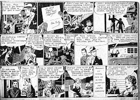
Only they aren't really Bruce Gentry. They're adventures of Alain Carter, Pilote Detective, in photocopies given me a dozen or more years ago by famous French comic artist and fine gentleman, Gerald Forton. I had entirely forgotten them. Yesterday, in another excavation through my garage inspired by reading everyone else's blogs, I stumbled upon the envelope. Gerald worked at DiC Animation at the same time I did. We often chatted about our favorite classic comics, French and American. Gerald was another Ray Bailey enthusiast, and he xeroxed these samples from French reprint comics.I have 22 pages in all, comprising two adventures. The dates were removed, of course, but they apparently start at the strip's beginning. We're introduced to Bruce's future sidekicks: South American romantic Ricardo and comic relief hep-cat Jive. Both keep their original names in the French version (though I'm sure Jive's name is pronounced Zheev). I think Jive is supposed to be a South American Indian. He got his nickname when he returned from a visit to the States obsessed with swing music and speaking jive lingo.
Bruce Gentry was an attempt to reinvent the fly-guy adventure strip to fit a postwar world. Unlike Steve Canyon, which launched the next year, the war and the military didn't play a part in the strip. Bailey wanted to start with a clean slate. This teaser ad from July 1945 makes that point outright in the final sentence. Odd that they reveal that sexy Eden Cortez works for a spy--that was supposed to be a surprise for week two! (Sidebar: it strikes me funny that in 1945 they say Caniff is famous for "Male Call." Terry who?)
Bailey's complete command of his drawing is apparent from the outset. Gone are the uncertainties of his Vesta West days. Ray learned well during his years with Caniff. Characters, backgrounds, and staging are slick and thoroughly professional. His style would evolve further. For one thing, he hadn't settled on his standard "good guy" face. For another, he plays the scenes mostly in close-ups and medium shots; in comic books he would begin using more full-figure shots. In the absence of the original strips, I want to retranslate these into English and post an entire story for other Baileyphiles. Stay tuned!
One question gnaws at me. Why does the letterer put the characters' names in ALL CAPS? Is this one publisher's idea or was it commonplace in French comics? I'm reminded of how DC comics used to put a hero's name in boldface each time it appeared. I grew up reading comic balloons "aloud" in my head, and to me boldface meant a word was spoken louder. So people in DC comics talked funny. I could accept, "Look! It's Superman!" but not, "Come right in, Superman!"
Come to think of it, certain writers used boldface in odd ways. One way to recognize Paul S. Newman's work is that he'd boldface "not" and "don't" even if it didn't make sense in context: "You go to bed, dear. I'm not sleepy yet," or "This is his car but I don't see him anywhere." Jack Kirby had a similar thing for "not." Harold Gray would boldface (or rather, underline) so many odd words that rumors popped up saying he was sending some kind of coded messages!