Tuesday, January 17, 2012

Piero Mancini, Comics Artist

Mino, Lia, and Piero
Piero Mancini was an Italian illustrator/comic artist with an appealing minimalist style.

[For the following details I'm indebted to a biographical entry at the Fondazione Franco Fossati, a fabulous resource on Italian comics history.]

Piero Mancini was born in Adria in 1927.  His family moved to Milan while he was still a child. It was there he studied art, at the Brera Academy of Fine Arts.

In the early 1950s Mancini moved to Padua to work in advertising and illustration. He began a collaboration with the Catholic kids' weekly Sant'Antonio e i fanciulli (St. Anthony and the Children), which was later retitled Il messaggero dei ragazzi (The Kids' Messenger). Though he mostly produced illustrations, Mancini also wrote and drew a police-themed story/quiz in comics form.
One of a series of Bob Star (Red Barry) covers for Club Anni Trenta
Up until the mid-1960s Mancini created numerous illustrations for a series of literary adaptations. Among the most noteworthy were a dozen plates illustrating The Divine Comedy. In 1966 Mancini started drawing comics for the Messaggero, beginning with a story about Giotto. During the next decade he provided artwork for many comics features. His best-known work was on the series Mino e Lia, written by Claudio Nizzi. Mino and Lia were ordinary modern kids who stumbled into various adventures. The series ran from 1972 to 1975.
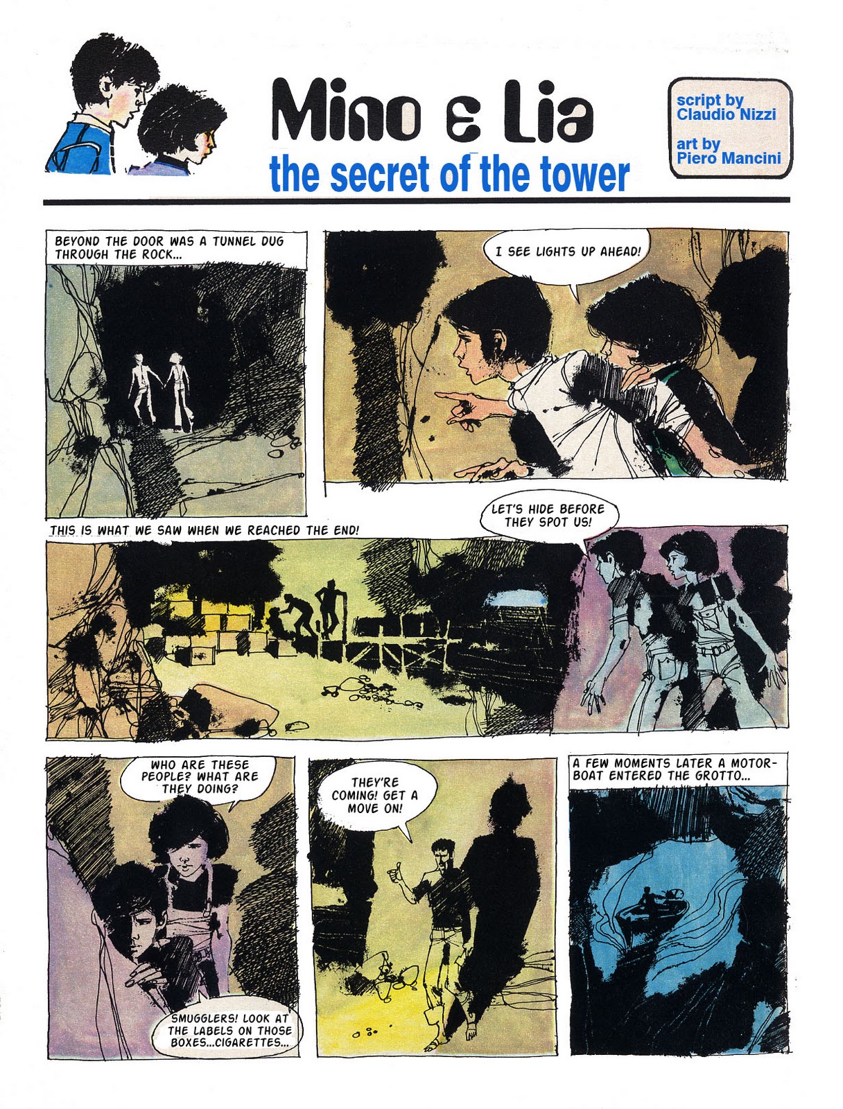
Collection of Mino & Lia from Mera-Fumetti

In 1977 Piero Mancini illustrated an adaptation of The Diary of Anne Frank which appeared in Sgt Kirk. It was his last major project, for the artist passed away in 1979 at the age of 51.

Mancini's impressionistic style bears a certain resemblance to the work of Dino Battaglia. He went even further than Battaglia in experimenting with unusual textures. His toolkit included pen, brush, sponges, razor blades, and toothbrush splatter. The result was a very personal and attractive style which admittedly sometimes sacrificed detail for effect.

Following is one of Mancini's Mino and Lia adventures. Though only 9 pages long it was split across two issues of Il Messaggero. In fact I think it was originally intended to run in three parts. In the Italian original the last panel on page 3 seemed to set up a cliffhanger and the first row of panels on page 4 look like they were extended upward to cover a gap left for the series logo.

It's a very simple, very low-key story. A hallmark of the series was the way Mino and Lia spoke directly to the reader. Personally I find the schtick annoying, though it does help hurry the story along. To my eyes the coloring is also reminiscent of Battaglia. I have no idea whether Mancini did it himself.

All in all this is a nice job by a lesser-known star in the Italian comic universe.


English version by Ron Harris

Wednesday, January 11, 2012

Character Design--Spanish Women

The Mystery of the Spanish Woman

 
In this post I don't tell you, I ask you to tell me.


I am fascinated by the iconic Beautiful Female Face drawn by Spanish comic artists. I hope someone out there can tell me where it came from.

I first encountered the Face in the work of cartoonists employed by the Selecciones Ilustradas studio of the late 60s. These young men revolutionized comics with their work both for Spanish publications and for clients in England, France, Germany, and the USA. Among them were Esteban Maroto, Carlos Gimenez, Victor de la Fuente, Jose Ortiz, Jose Gonzales, Luis Bermejo, Rafael Auraleon, Enric Sio, etc. etc. etc. American fans first met many of them in the pages Jim Warren's horror comics, Creepy, Eerie and Vampirella.


Though their individual styles varied greatly, all these guys drew variations of the same Beautiful Female Face.
 

Rafael Auraleon, Jose Gonzales, Adolfo Usero, Jose Ortiz

At first I thought the Face was the product of the studio environment. This often happens when many artists work in the same room, especially if they're young and enthusiastic: they pick up bits of each other's style. Perhaps one of the SI men drew the Face and everybody else liked it and copied it. Or maybe an editor (or studio manager, art director, client) liked the Face and insisted everyone draw it.

Jesus Redondo, Homero


Later, though, I ran across the Face drawn by Spanish artists not connected with SI. It seemed that almost every Spanish comic artist with a "modern" (i.e. post-fifties) style used the Face. 

I associate the Face with the mid-to-late 1960s. I wish I knew more about Spanish comics from this period. Browsing Joan Navarro's excellent gallery of classic Spanish comic art I discovered artwork from late 1950s-early 1960s romance comics in which the women almost had the Face...with differences in hair style and makeup, of course.


 Purita Campos
Did the Face originate in Spanish romance comics? Was there a particular artist who created it and inspired an generation of younger cartoonists? Why is the Face particularly Spanish? A few Italian, British, and Mexican cartoonists used it, but they seemed to do so in imitation of the Spaniards.
 Frank Langford (UK)

Does anyone know the origin of this classic Spanish beauty?

Tuesday, January 3, 2012

Stuff I've Done--9


My Favorite Star Trek Page
I remember the years when I was drawing Dallas and Star Trek as a blur of lots of work, lots of frustration, lots of drama, and not much money.

I was originally hired to draw Dallas, but when Thomas Warkentin left Star Trek, that was the strip I really wanted to draw. Not only did I like the property better, but also Paramount pretty much left the strip alone. There was none of the nasty, iron-fisted editorial intervention that Lorimar practiced on Dallas. That was partly why I offered to take the strip on. Another piece was that I'd be earning more money. But the major reason was to provide an entry into the syndicate for a "good friend." This laid the groundwork for much of the aforementioned drama. Suffice it to say that one should keep personal and professional relationships separated. Widely separated.

My final Trek storyline concerned the Enterprise entering a regatta and running afoul of space pirates. It was my favorite story of the bunch. It followed a long, incredibly-complicated nightmare on which the writer collaborated with noted s-f author Larry Niven. That episode is a story in itself. I suppose I'll tell my side of it one day. I mostly remember the story as Advanced Lettering 101. There was lots of this:In comparison the regatta story was just the right length, focused, and well-plotted. The dialogue was good and there were nice character bits. It was a joy to work on, though I didn't stay through to the end. Thomas ghosted the last two weeks after I resigned both strips in a state of exhaustion.

I was always playing catch-up on Trek. The syndicate cared more about Dallas, which made a lot more money even after losing half its original list of papers. But one weekend I stayed up extra-late to do this Sunday. It remains my favorite bit of Trek art. It was one of the few originals I kept. The others I sold cheap in a fit of depression to some art dealers pretending to be fans.

The writer and I snickered over the suggestion in panel 3 (Kirk putting on his shoes) that Kirk had slept with Vera DiMarco. It was as close to sex as anyone got at the L.A. Times Syndicate. I luxuriated in doing the Wood inking thing and devoted loving attention to Vera's clingy gown. Here's a scan of the b&w proof sheet: The color version above is from the Houston Chronicle, one of the few papers that carried the strip.